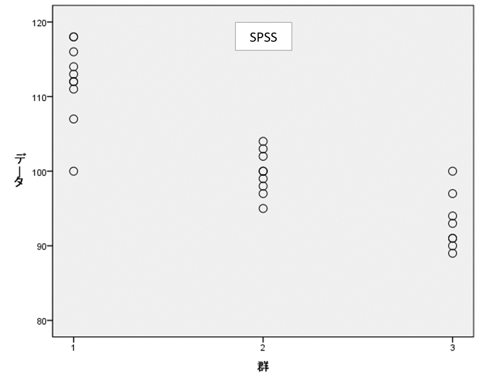
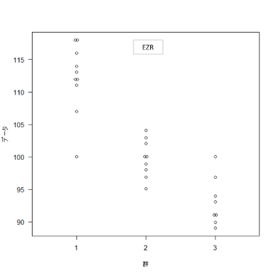
Exercise:
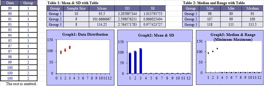
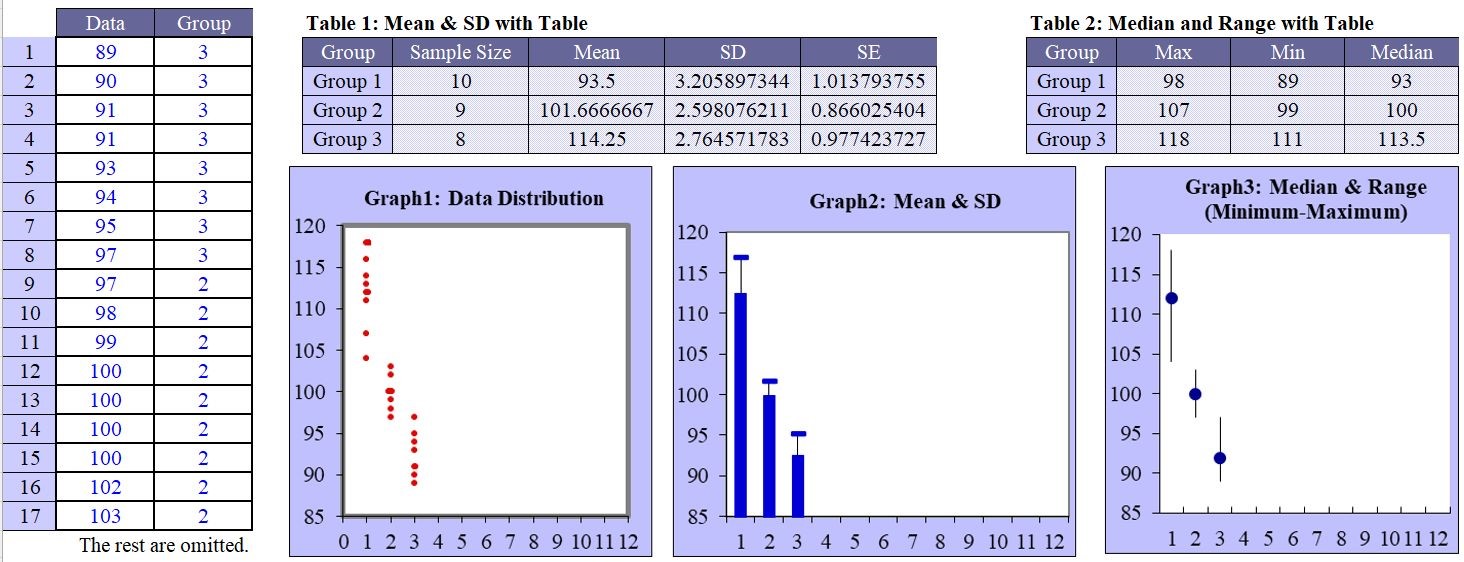
Healthy subjects were randomly allocated into 3 groups and exposed to 35% (Group-1), 30% (Group-2), or 25% (Group-3) fat containing diet for a certain period. Following the diet treatment period, blood cholesterol levels were measured and used to obtain the results shown on the left side. Make a scatter-plot graph of the data.
Please arrange the groups in descending order.

Reports of SPSS & EZR
The data distribution plots in SPSS and EZR are shown.
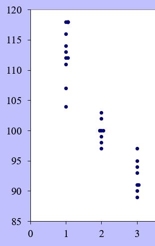
StatFinale’s Graph1 is a data distribution chart. If you change the format of the data distribution in worksheet G1, the graph shown below will be displayed. Set the maximum and minimum values in the axis formatting and select the type and size in the marker formatting.
※Click pics to enlarge.